Chart
Create a Simple XY Scattergram Chart
- Create a new blank report or load an existing report.
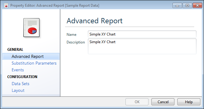
- Select Advanced Report and fill in the Name and Description details for the chart.
If you are editing an existing chart, you can manually start the chart wizard by clicking the smart tag and selecting Run Wizard...
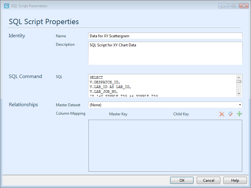
- Select Data Sets and view the SQL Script Properties that determines what data is available for the chart.
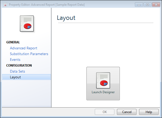
- Select Layout and click on the Launch Designer icon to bring up the Report Designer.
- In the Report Designer, drag and drop the Chart control from the Standard Controls Toolbox tab onto the Detail band.
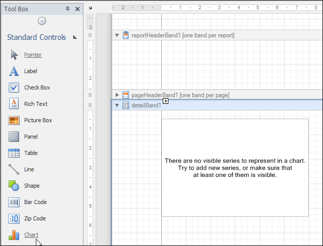
The chart wizard appears.
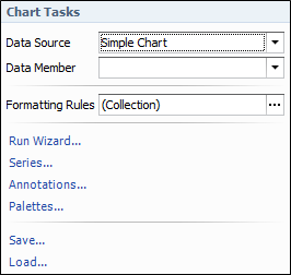
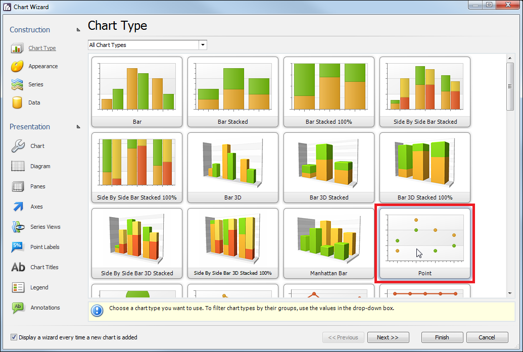
Run the Chart Wizard.
- Select Point from the available chart types, then click Next.
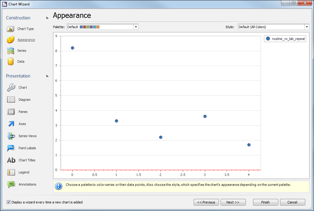
- Choose from the available Palettes to determine the colour settings for the graph. Choose from the available Styles, then click Next.
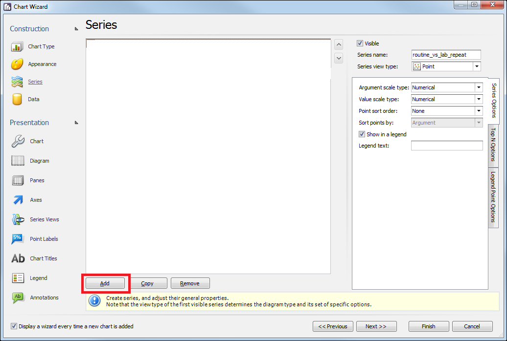
- Create the data series (routine_vs_lab_repeat) by clicking the Add... button.
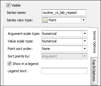
- Fill in the details as shown below to define the data series.
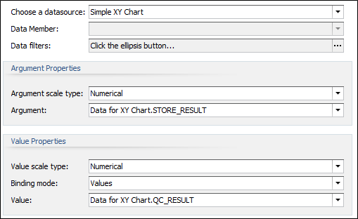
- Click Next to move to the Data page, click on the Series Binding tab and select the routine_vs_lab_repeat series. Fill in the details as shown below:
Customise the Chart's Presentation
The Chart control allows you to easily create distinctive charts with many options on how it will be displayed. These options can be found under Presentation on the left hand side of the Chart Wizard.
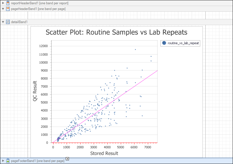
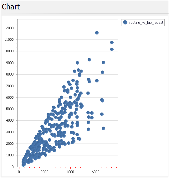
The basic scatter plot chart created so far is as shown below:
To improve your chart's appearance, make the following changes:
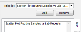
- Click on Chart Titles, click on Add and add an appropriate title to the chart . The title is placed on top of the chart and centred about the X axis.
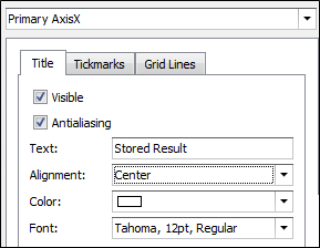
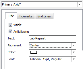
- Add labels for the X and Y axis. To do this, first click on the Axes object, then click on the X axis in the graph. Click on the Elements tab and fill in the properties as shown below:
- Change the Primary axis using the drop-down list. Fill in the properties as shown below:
- Remove the chart's legend. It is not required as their is only one data series. To do this, click on the Legend object, then uncheck the chart's Visible property. Notice that the check box is used to either display or hide the legend.
- Now reduce the size of the circles used to display the point data. Click on Series Views and select the Marker tab. Reduce the size from 10 to 2. The points are displayed as smaller dots giving better clarity in the image.
- Finally, add a "line of best fit" based on the data. Select the Indicators tab, click Add and select Regression Line. Click OK.
- Close the Report Designer, then click OK on the Property Editor to save your changes.
- Click Finish to exit the Chart Wizard.
It is possible to easily customise many other properties to improve the readability and usefulness of the chart. Try it and see!
Get the Result
The final result, with the chart embedded in the Detail Band, is shown below: