Property Editor: Pivot Column
To change the properties of a Pivot Graphic Column template, click on the graphic column (either in the templates list or in the report) and select the Properties menu option to display the Pivot Graphic Column Property Editor. Alternatively, right-click and select Properties from the right-click menu.
A Pivot Graphic Column is a special type of graphic column that is designed to handle normalised depth interval data.
The dataset used should have one or more rows per interval; the rows for each interval are then "pivoted" to be shown adjacent to one another. The Horizontal Scale for each adjacent bar is the proportion of the horizontal scale represented by the Primary scaling column value set for the Horizontal scale (or the difference Secondary-Primary if both are set).
To display in an "x-y bars" manner, ensure there are no gaps in the horizontal scale and that the proportions do not exceed the horizontal scale.
General
On the General tab, identify the template object and specify size, position, border and visibility options.
Identity
The Name attribute is used to identify the template in the Templates list. Template names must be unique. Choose a short but descriptive name which includes the template type and data category.
To avoid potential problems, avoid using spaces or special characters in template names.
Optionally enter a Description that describes what data is associated with the template object.
Size and Position
The template position is specified relative to the top left corner of the drawing area. The left co-ordinate (X) gives the offset from the left edge of the drawing area to the left edge of the template. The top co-ordinate (Y) gives the offset in millimetres from the top of the drawing area to the top of the template. These measurements do not include the page margins. Furthermore, scale bars have annotation margins which are also not included in the measurements. The co-ordinates of a scale bar refer to the top left corner of the bar itself.
Use the Width and Height properties of the object to adjust the size of the template object in the report. Keep the aspect ratio the same in order to prevent distortion of the image.
Border Style
Specify whether or not a rectangular border should be drawn around the template object. If you choose to draw a border, choose a single or double line style.
Visibility
Select the Hide this object option to hide the template object. The template will still be available for selection in the Templates list, but will not be visible in the report.
Data
Primary Data Source
A ' data-aware' template type, derives its data from one or more datasets. Select a source dataset and a source column (field) from the drop-down list.
Lookup Data Source and Formatting
The Graphic Reporter supports "on-the-fly" decoding, eliminating the need for decoded extract tables. During the decoding process, the coded value of the source field is translated to its associated description by performing a code lookup against a nominated code table. All the parameters needed for this process must be defined at design time, including:
- the Datasource name (which must be included as one of the datasets in the report);
- the Code column (field in the lookup table) that is used as the lookup key;
- the Description column (field in the lookup table) that contains the full description for the code.
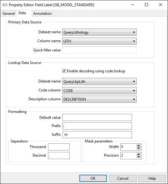
Formatting
Optionally, specify a default value for the column you have selected. The default value is displayed on the report when the primary data source returns the data.
The formatting and decoding parameters displayed above are applicable to the chosen Column (LITH1).
The code in this field will be translated to its full description using the QueryLkpLith dataset, using CODE as the matching key field and returning the content of field DESCR as the text to display.
Formatting is done implicitly using separate Width, Precision, Prefix and Suffix fields (which can be blank). The Format string is compiled according to the following rule: Prefix + %[Width].[Precision][Type] + Suffix.
Options for Thousand and Decimal separators are also available.
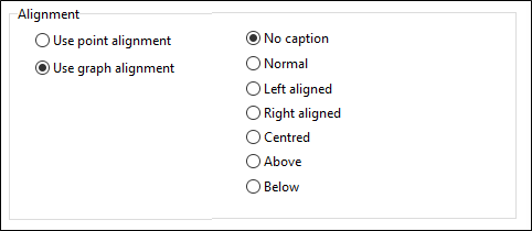
Annotation
In the Annotation tab, select the alignment of the annotation and the font characteristics of the displayed text. To turn off the annotation, select the 'No caption' option.
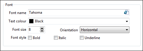
Select the font style, font size, and font Colour to be used for the annotation. You can also set the orientation of the text.
The characters in a vertical column are rotated 90 degrees anti-clockwise (up) or 270 degrees anti-clockwise (down). The characters in a stacked column are not rotated, but simply displayed vertically, as illustrated in the example below:
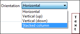
This option is enabled for Text labels, Field Labels, Date labels and Hyperlink labels.
Some printer drivers do not support the technique used to render the stacked text. Generally, colour printers will support the feature, while black and white printers will not. If your printer fails to display stacked text, try setting the raster graphics options for the printer and try again.
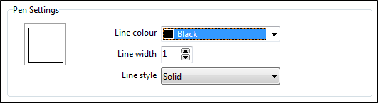
Colours
In the Colours tab, set the pen and brush colour and style options. A preview icon is displayed to the right of the colour, width, and style input boxes.
Pen Settings
The pen colour is the Colour used to draw the border and other lines making up the template. The pen style is the (solid, dot, dash etc.) line style and width used to draw the border and other lines making up the template.
Only solid lines are supported for line widths greater than 1.
Brush Settings
Set the brush (fill) Colour and style options. The brush colour is the colour used to render the background of the template. The fill style is the hatch or stipple used for the background.
You can fill the background using a standard brush, or you can base the symbology of the column on a Legend template.
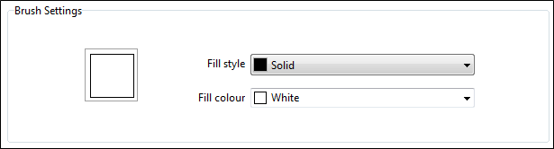
While a graphic column uses a single column for the legend lookup, it is possible to base the symbology on a combination of fields (e.g. lithology type and descriptor) by concatenating these field values in a query. However, the legend would have to be set up accordingly, using a code list that caters for all possible code combinations.
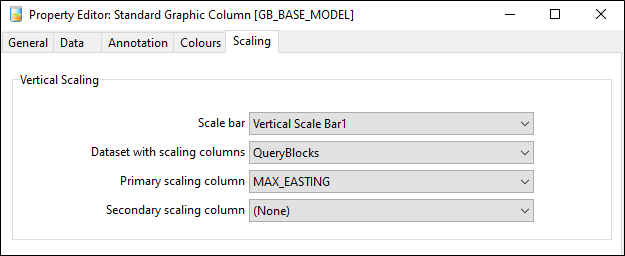
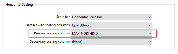
Scaling
The Scaling tab applies to all templates, except rectangles, labels and legends.
Vertical / Horizontal Scale Bar
A scaled template is usually associated with at least one scale bar. It uses a vertical scale bar to control vertical scaling and a horizontal scale bar to control horizontal scaling.
Text columns can be scaled vertically but not horizontally.
Datasets with Vertical / Horizontal Scaling fields
The field values used for scaling are retrieved from the scaling datasets. These datasets are usually the same as the primary dataset. If not, then the scaling datasets should have a one-to-one relationship with the primary dataset.
Point graphs often get their annotation data from one dataset and their scaling fields from another.
Primary and Secondary Scaling fields
When the system draws a template, it uses the values of the nominated scaling fields (retrieved from the scaling datasets) to determine the offsets along the associated vertical and horizontal scale bars.