The Chart window comprises two parts: the graph and the Properties window. The Histogram graph comprises three main parts:
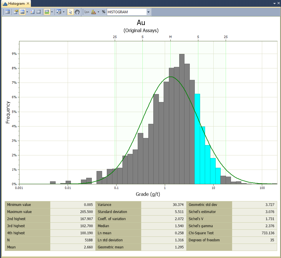
- the raw data, displayed using the input colour
- the standard normal curve of a theoretical sample with the same mean and standard deviation as the raw data, displayed using the distribution colour, and
- vertical lines at the mean (M) and standard deviations (S, 2S) either side of the mean, displayed using the band colour.
Visually, the graph allows you to determine much about your data:
- Is it normally distributed? In other words, how well does it fit the bell-shaped standard normal curve?
- If the fit is poor, can you describe the discrepancies in terms of Skewness and Kurtosis, multiple peaks or anomalous regions?
You can visualise and quantify the answers to many of these questions by performing a statistical decomposition. See: Decomposing data sets.
Display an Existing Distribution Form Set
To display an existing form set in a new chart:
- Click the Forms button at right of the form and choose the form set.
- Click OK to apply the settings to the new chart.
Errors at this point typically refer to a new chart feature with no equivalent in the old graph. To assist you, Micromine will highlight the offending form response once you read and dismiss the error message.
Redisplay the Chart form
To redisplay the Chart form:
- Click the Form button at left of the Chart toolbar

- Alternatively, double-click on the chart's name in the Display Pane
You can display multiple copies of the same chart using Stats | Histogram (Multivariate).
Change the Graph Minimum and Maximum
The Histogram function uses the true minimum and maximum for charts whenever the natural log transformation is used. Previous versions used padded values that often reached a minimum of zero, creating very long left-hand histogram tails. The new method avoids the need for manual adjustment.
You may need to recalculate the minimum and maximum graph values to produce a correct histogram from older (earlier version) form sets, but generally only for those incorporating the natural log transformation.
To change the graph minimum/maximum:
- Click the Form button at left of the Chart toolbar, or double-click the chart name in the Display Pane to redisplay the Histogram form.
- Switch to the Graph Limits tab and then click the calculator icons
 at right of the Minimum and Maximum values (don’t click the big Calculate button yet!).
You should not have to change the graph minimum or maximum of existing forms incorporating normally-distributed data.
The histogram is unique because it includes options for setting the graph limits and axes ranges. You use Graph Limits to limit the data used in the chart, and Axis Range to configure the visible axis limits of the graph.
Calculate the Bin Size
We recommend using around 50 bins for any histogram that is intended for statistical decomposition. You can use the Calculate button on the Graph Limits tab to determine the bin size from the number of bins you specify and the graph minimum and maximum values.
To calculate the bin size:
- Ensure the Minimum and Maximum values are correct.
- Click the Calculate button and enter the Number of bins.
- Click OK to apply the calculation, and note the Bin size value.
- Optionally round the bin size to a simpler number.
Interact with the chart
Zooming and panning within a chart relies on the middle mouse wheel button:
- To zoom in or out: roll the mouse wheel towards or away from you
- To zoom the X-axis only: roll the mouse wheel whist holding the Ctrl key
- To zoom the Y-axis only: roll the mouse whilst holding the Shift key
- To pan the chart (when zoomed in): drag with the middle mouse button
History
When you right-click in a chart, a context menu lets you choose from a History of recently-used functions.
If a tool is active (i.e. Panning), right-clicking in the Chart window will deactivate any active tools. Right-click again to view the context menu.
Chart toolbar
The options on the left-hand side of the toolbar are applicable to most charts:
| Button | Description |
|---|---|
|
|
Click the Form button to open the form associated with the generated chart. |

|
Click the Properties button to view the properties of the chart in a Property Window. |

|
If properties are supported for the type of chart being created, click the Chart Properties button to show properties on the chart itself. Options that determine the position and the width of the Properties pane are provided. |
|
|

|
Click the Show Legend button to display a legend on the chart. See: Legend |

|
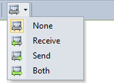
Select the Show File button to open the input file alongside the chart. You can use the Sync Selection options on the Chart toolbar to synchronise data selections in Vizex or the File Editor. See "Sync" below. |

|
Click the Refresh button to refresh the chart. This may be necessary when changes have been made to the underlying data. |

|
Use the options on the Sync tool menu to synchronise selections between the chart and a Vizex layer or the File Editor. See: Synchronising data selections |
|
|
| You can tile a chart with Vizex by right-clicking the tab at the top of the chart window and choosing New Vertical Tab Group from the pop-up menu. | |

|
If a colour set has been applied to the chart, click the Colour Set button to show the colour set in a legend. |

|
If a symbol set has been applied to the chart, click the Symbol Set button to show the symbol set in a legend. |

|
If a palette has been applied to the chart, click the Show Palette button to toggle the display of the palette on and off. |

|
Click the Print button to send an image of the chart to a printer. The chart will be re-scaled so that a best-fit of the page is achieved, while still maintaining the aspect ratio. |

|
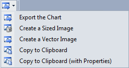
Click the Export button to Export the Chart: |
|
|

|
Click the Select tool to interact with some types of chart. |

|
Click the Pan/Zoom tool and then scroll the mouse to zoom, or click and drag the mouse to pan. |

|
Click the Point Annotation tool to use the mouse to digitise a point on the chart. |

|
Click the Label Annotation tool to use the mouse to digitise a point to set the position of a label on the chart. For more information, see: Data Annotations. |

|
Click the Line Annotation tool to use the mouse to digitise two points to set the position, length, and orientation of a line on the chart. |

|
Click the Horizontal Line Annotation tool to use the mouse to digitise a point to set the position of a horizontal line on the chart. For more information, see: Data Annotations |

|
Click the Vertical Line Annotation tool to use the mouse to digitise a point to set the position of a vertical line on the chart. |
| Select the active Chart Annotation Style. Annotations created interactively will use this style. | |
|
|
| Note that annotation styles are created and edited in the underlying form, not on the chart itself. | |
|
|
Click the Clear Annotations button to clear the annotations added to the chart. |

|
Click the Move Annotations button to move selected annotations. Left-click the mouse to position the annotations you are moving. |

|
Click the Help button to view an online help topic for this function. |
Other tools on the Chart toolbar are specific to the type of chart displayed. In the Histogram display, tools are also available which allow you to highlight the corresponding data in Vizex and the File Editor. A Percentile function allows you to find a value corresponding to a given percentile and display it on the chart.
| Button | Description |
|---|---|

|
Click the 3 Parameter Log Normal button to estimate the additive constant for a 3-parameter log-normal distribution. |

|
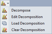
Select an option from the Decompose tool menu: |
|
|
| Select Decompose to decompose (divide) the data into a mixture of normal distributions. | |
| Select Edit Decomposition to edit the current decomposition. | |
| Select Load Decomposition to load a saved decomposition. | |
| Select Clear Decomposition to clear the current decomposition from the chart. | |

|
Click the Percentile button to display a data value corresponding to a given percentile. Specify a colour for the line that will be drawn on the chart. |

|
Toggle Multi-chart layout mode on and off. When this mode is active, each variable is shown on a separate graph. |

|
Toggle Side by Side mode on and off. When this mode is active, the bars are shrunk and shown side-by-side instead of overlapping. |
Display mode
Choose a Display mode for the distribution:
- HISTOGRAM Displays a bar chart. The width of each bar is equal to the bin size you set. The height of each bar is proportional to the number of values in each bin.
- CUM FREQ An alternative way to visually analyse the statistical distribution is to display a line chart that shows the amount of data less than or equal to the bin value.
- PROB PLOT From the X axis you can read the probability of observations less than the specific value defined on the Y axis.
The probability plot uses a non-uniform scale that starts with a probability of 0.01 and goes to a probability of 0.9999. On this graph, if the Scale is set to Linear, a normal distribution will appear as a straight line. If the Scale is set to Natural Log, the graph of a log-normal (Ln) distribution will be a straight line.