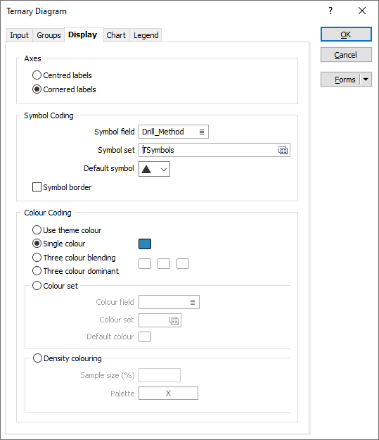
Display
Use the Display tab of the Ternary Diagram form to set label options for the axes of the triangle, and set label, colour, and symbol options for the data points.
Axes
Choose how the axes of the triangle are labelled:
| Centred | Labels are centred along each axis. |
| Cornered | Labels are positioned at each corner of the triangle. |
Symbol Coding
Symbol field
To display data points as symbols, specify the name of the field (in the input file) containing the data that will control which symbol is displayed.
Symbol set
Double-click (F3) to select the set that will be used to control which symbol is displayed. The symbol set determines a symbol for each value in the chosen (mapped) Symbol field. Right click (F4) to create or edit a symbol set.
Note that chart symbol sets are separate to the symbol sets used elsewhere in Micromine. Ranges may be assigned to them in the usual way.
Default symbol
You can either accept the default symbol displayed or double-click on this symbol to choose a different one. A range of standard (Circle, Square, Diamond, Pentagon, Hexagon, Star, Triangle, Plus, Cross) marker symbols are available for selection in a drop-down list.
Symbol border
Select this option to toggle the data symbol border on and off.
Colour Coding
Use theme colour
Select this option to apply a default theme, or the theme colours you have selected on the Chart tab of the form.
Single colour
Select this option to apply a single colour to the data points in the diagram. Double-click (F3) to select the colour.
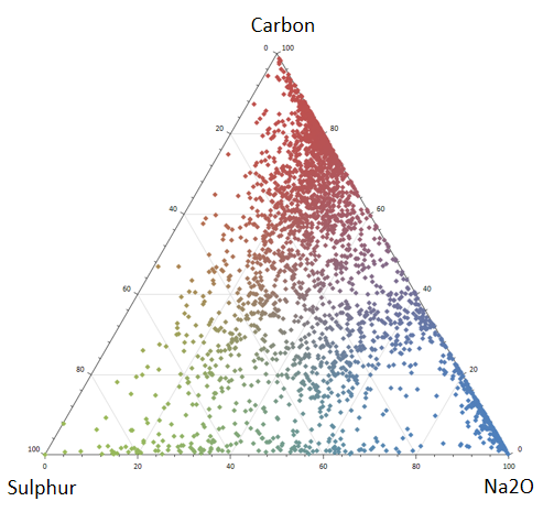
Three colour blending
In this mode, a sequence of three blended colours is applied to the data points. Double-click (F3) to select the colours to blend.
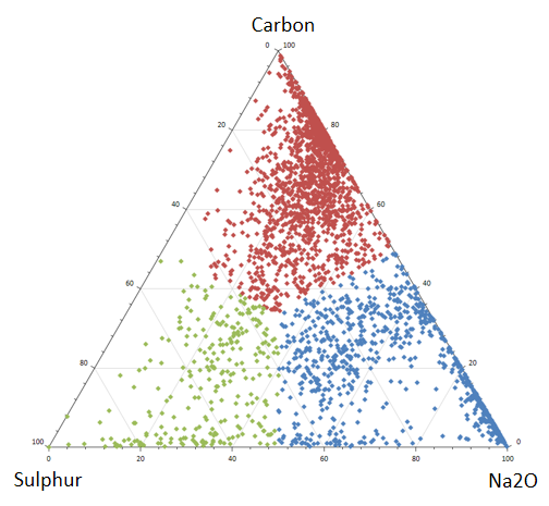
Three colour dominant
In this mode, each point takes the colour of its closest component. Since there are only ever three colours on display, the implied boundaries between clusters may be more evident than in blending mode. Double-click (F3) to select the colours.
Colour Set
Select this option to colour-code the data points using a nominated colour field and set.
Specify the name of a Colour field which contains the values that will be used to colour-code the display.
You can choose to select colour values directly from the Colour field without selecting a Colour set. In this case, the values in the Colour field must be valid RGB, Hex, or Integer colour definitions.
| Format | Example |
|---|---|
| R,G,B | 89,169,215 |
| HTML Hex | #59A9D7 |
| Hex | 0x59a9d7 |
| int | 5876183 |
To map values in the Colour field to the colour values in a Colour set, double click (F3) to select the set that will be used to control the display colour. Right-click (F4) to create or edit a Colour set.
Double-click (F3) to select a Default colour that will be used when a Colour field or a Colour set is not defined - or when a value in the Colour field is either not valid or is not mapped in the Colour set.
Density Colouring
When there is a high density of data points it may be difficult to identify the zone where most of the data lies within the mass of points. This can be resolved by colour-coding each point according to the density of the points within its neighbourhood.
Sample size %
The size of each neighbourhood is a percentage of the sample size, with typical values ranging from 2% to 20%. Sparser or more evenly distributed data may require a larger sample size.
Optionally, you can use the colour range defined in a palette to colour code the points in the diagram.